Revamping Reckitt’s Sales Intranet Portal
Reckitt needed a way to streamline sales operations by managing inventory, orders, and sales documents in one centralized platform, but users were struggling with an outdated interface, poor navigation, and a lack of visibility into key information like discontinued products and inventory status.
I redesigned Sales Connect — a comprehensive internal portal for order and inventory management — into a clean, modular platform with simplified navigation, clearer architecture, and reusable UI components. This led to faster task completion, reduced user frustration, and scalable support for future product growth.
As one sales lead put it: “It’s clean, fast, and I don’t need help to use it anymore.”
Role
Prime designer
Duration
6 Months
Design collaborators
Payal Tanksale
Unified sales dashboard

The new dashboard that redefined Reckitt’s internal workflows
“But getting here took 12 months, dozens of interviews, and a complete information architecture overhaul”
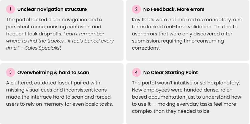
The challenge

Before
What we set out to achieve
The redesign wasn’t just about improving visuals — it was about reducing friction in everyday workflows.
Simplify Navigation & Structure
Restructure information architecture to help users quickly find core tools like product management, tracking, and approvals without jumping across pages.
Surface Key Actions Upfront
Create a unified dashboard experience that brings approvals, stock updates, and reports into one place — reducing time-to-action.
Improve Clarity & Visual Hierarchy
Redesign layouts with better spacing, scannability, and consistent iconography to minimize cognitive load and avoid guesswork.
Enhance Input Confidence & Feedback
Introduce clear field indicators, inline validation, and feedback mechanisms to reduce user errors and avoid costly rework after submission.
Final Design
Before
After

Simplified navigation to surface key tools like tracking and approvals in fewer steps.

Designed a role-aware, customizable dashboard to replace dense documentation and give users a clear daily starting point — reducing time-to-action and improving self-guided use.
Artefacts
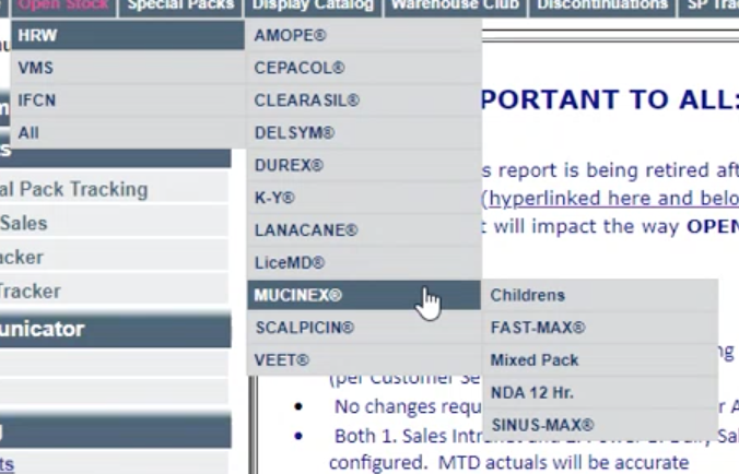
Information Architecture

The original portal buried key tools across multiple menus. We reorganized the architecture into three high-level zones based on user roles and frequency of use:


Modular components designed for scale and product growth
-
Reusable card templates
-
Contextual action buttons
-
Inline alerts and icons
-
One design = multiple use cases
“It’s clean, fast, and I don’t need help to use it anymore.” — Sales Lead, Reckitt
Reflections
How our final figma file looked!

Redesigning Reckitt’s intranet portal was more than just a visual refresh — it was a deep dive into simplifying workflows for real users. This project reinforced the importance of designing for clarity, efficiency, and scalability in enterprise environments.
What worked well!
-
Collaborative Research: Working closely with end users and internal teams helped us uncover meaningful friction points and build trust early on.
-
Component-Driven Approach: Creating a reusable system of components not only improved usability but also laid the foundation for future product consistency.
-
Data-Led Design: Usability feedback and metrics guided design decisions and gave clear direction to stakeholder conversations.
Good enterprise UX isn’t just about simplifying screens — it’s about reducing friction in complex workflows. This project reminded me how clarity, consistency, and user context are the foundations of a system users will actually adopt.