Simplifying Reckitt’s admin portal
Reckitt needed a way to efficiently manage backend operations like inventory updates, user access, and special pack configurations across global teams, but users were struggling with a fragmented interface, confusing workflows, and overreliance on documentation for routine tasks
I redesigned the Sales Connect Administration Portal from the ground up — creating a modern, intuitive, and scalable system with clarified navigation and reusable UI components that enhanced daily operations. This led to 40% faster task completion, a 3x drop in onboarding support tickets, improved data accuracy through real-time validations, and overwhelmingly positive feedback from both sales leads and admin teams.
Role
Prime designer
Duration
6 Months
Design Collabrators
Payal Tanksale
Problem
Observation sessions revealed that most users relied on documentation or created their own workarounds just to complete basic tasks. The lack of visual hierarchy, missing primary actions, and inconsistent patterns made the portal frustrating to use and inefficient for daily operations.
Before

Unclear
Navigation
structure
Dense layouts with no visual hierarchy forced users to rely on memory.
Lack of field validation caused high error rates in submissions
No clear primary actions and visual hierarchy, forcing users to rely on guesswork and slowing down critical tasks.
Design goals
What we set out to achieve
To reduce friction in high-responsibility admin workflows, where accuracy, clarity, and control are essential, while at the same time enhancing visually.
Streamline Role-Based Navigation
Restructure the portal so admins can quickly access user roles, stock updates, and approval workflows without jumping across disconnected modules.
Make Critical Actions Easy to Find
Surface essential admin tasks, like granting access, editing product packs, or updating availability in clearly labeled views with prominent, consistent CTAs.
Increase Clarity in Complex Forms
Design admin-facing forms with grouped fields, spacing, and contextual cues to reduce overwhelm and improve confidence during data entry.
Support Accuracy with Feedback & Validation
Add inline validation, confirmation messages, and error prevention mechanisms to reduce admin-side mistakes and support high-stakes updates.
New layout

Clear Navigation
Introduced a clear left-hand nav with logically grouped admin functions, persistent labels, and active states to reduce guesswork and improve way finding.
Visual Hierarchy
We restructured layouts using spacing, alignment, and labels to prioritize key actions and guide user flow. Mandatory fields were clearly marked, and inline validation was added to minimize rework.
Challenge : Ambiguous actions
Critical CTAs like “Save” and “Save as New” were unclear. Placed side-by-side without context, users often confused these options — sometimes overwriting records when they meant to duplicate them.

Introduced clearer button hierarchy, descriptive helper text, and confirmation dialogs to guide users through high-stakes edits with confidence
Challenge : No visibility into progress
In the legacy portal, long forms were presented in a single scroll-heavy view, making it difficult for users to know how much they had to complete — or which sections were related.
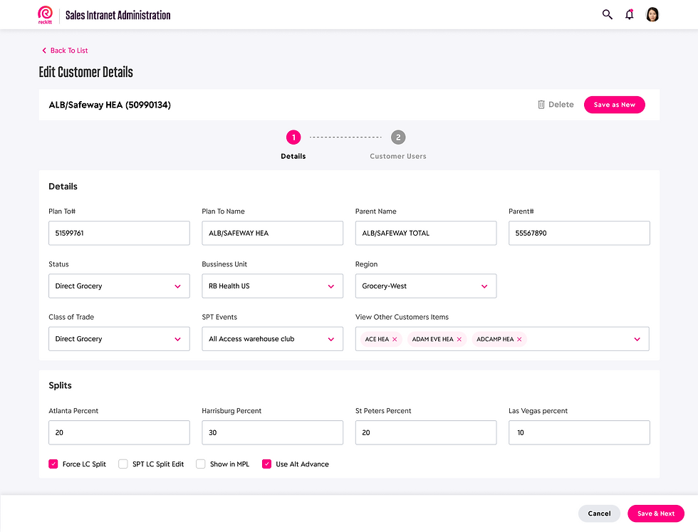
To reduce overwhelm and guide users through high-responsibility tasks like customer data edits and access assignments, we introduced a stepper-based layout.
Final design

Introduced visual cues to highlight changes like price updates, helping users quickly identify and verify modifications.
A complete user flow: Adding a new customer

Split long forms into grouped categories with clear field labels, dropdowns, and inline validation. Resulted in higher accuracy and faster completion.
Designed a scalable interface that adapts to different user hierarchies — allowing admins, sales teams, and managers to access the tools and data relevant to their role without clutter or confusion.

Added modals and toast-style confirmations after save actions to ensure visibility and reduce anxiety around task completion.
Impact and reflection

40% faster task completion across common workflows
3x fewer onboarding support tickets within the first month
Higher data accuracy through real-time field validation
Positive qualitative feedback from sales leads and admins
This project deepened my ability to design for complexity — blending user needs, technical constraints, and role-based logic into a clean, scalable system. It challenged me to think structurally, prototype with purpose, and deliver with precision.